Shapes, Text and Images
Lines, shapes, text boxes and pictures turn a wiring diagram into a readable sheet, and on their own they make concept drawings. This page covers the drawing tools, the General, Text and Image tabs of the properties pane, and page borders.
Drawing tools
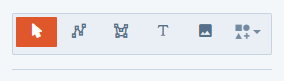
The Active Tool buttons at the top of the properties pane choose what a click or drag on the canvas does. Hover over a button to see its name.
| Button | Tool | Draws |
|---|---|---|
| Arrow | Select Tool | Nothing. Select, move and edit items, and drag between ports to draw cables. |
| Connected line | Polyline Tool | An open line with any number of segments. |
| Closed outline | Polygon Tool | A closed, filled shape with any number of sides. |
| Letter T | Text Tool | A text box. |
| Picture | Image Tool | A frame that holds a picture. |
| Shapes, with an arrow | Shape Tool | A shape you pick from a list. |
New items take their outline and fill from Settings > Active Stroke and Settings > Active Fill; see Page Setup and Drawing Settings. A polyline has no fill.
A drawing tool stays active after you draw, so you can draw several items in a row. Click Select Tool when you want to select or move things again.
Polylines and polygons
- Click Polyline Tool for an open line or Polygon Tool for a closed shape.
- Click on the canvas where the first point goes, then click at each corner.
- To finish, right-click or press Enter. A polyline needs at least two points and a polygon at least three.
While drawing, press Z to take back the last point, or Esc to cancel.
To change the outline afterward, select it with Select Tool and drag the handles on its points.
Text boxes
- Click Text Tool.
- Drag a rectangle on the canvas. A box reading
Textappears. - Switch to Select Tool, click the text and type. Click elsewhere on the canvas to finish.
Text wraps to the width of the box; drag the box’s handles to resize it. A text box has its own outline and fill, can hold a picture from the Image tab, and cables can connect to it.
Picture frames
- Click Image Tool.
- Drag a rectangle on the canvas. An empty picture frame appears.
- Switch to Select Tool, select the frame, and pick a picture on the Image tab. See Images.
Shapes
- Click the arrow on Shape Tool and pick a shape. The list has rectangles, squares, ellipses and circles, triangles, lines and curves, polygons from pentagon to dodecagon, stars and bursts, and symbols such as Cloud, Heart and NotAllowed.
- Drag on the canvas to draw it.
Shapes have an outline and fill and can hold a picture. Cables don’t connect to shapes.
Shape formatting
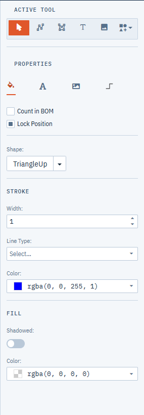
Select one or more items (anything except cables) and use the General tab. The top of the tab has Count in BOM and Lock Position; see Lock Position and Count in BOM.
Shape
The Shape button shows the current shape. Click its arrow and pick another shape to change the outline of every selected item. This works on functional blocks, text boxes and picture frames as well as shapes.
Stroke
- Width: outline thickness, from 0 to 20.
- Line Type: Solid, Dot, Dash, Long Dash, Dash Dot, Dash Dot Dot, Dash Dot Dot Dot Dash or Dot Dash Dot.
- Color: outline color.
Fill
- Shadowed: Yes adds a drop shadow.
- Color: fill color.
To change a cable’s line, use the Cable tab instead; see Cable properties.
Text
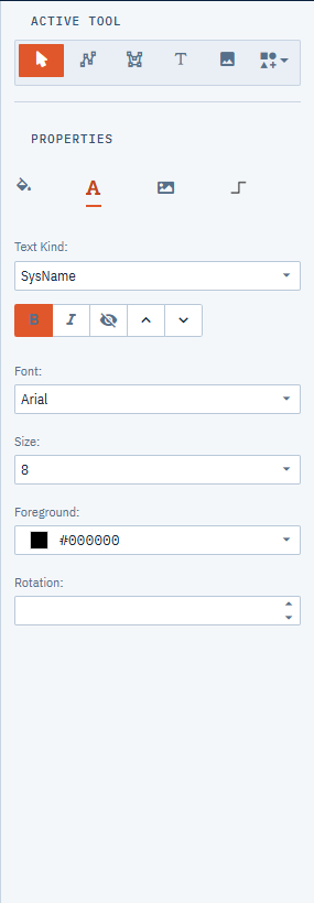
The Text tab styles the text of the selected items. Each piece of text belongs to a Text Kind, and you pick which kind to change.
- Select the items.
- In Text Kind, choose the text to change:
- (All): every kind at once.
- Plain Text: the text in text boxes and page border titles.
- Cable Number
- Manufacturer, Model, SysName, Alias, Location: the labels on blocks, racks and panels.
- Drawing Name
- Left Connectors, Left Ports, Right Connectors, Right Ports: the connector and port labels on each side of a functional block.
- Change any of these:
- the bold and italic buttons,
- the eye button, which hides that kind of text while it is pressed,
- the up and down arrow buttons, which make the text a step larger or smaller,
- Font: Arial, Calibri or Verdana,
- Size: 6 to 72,
- Foreground: the text color,
- Rotation: 0 to 359 degrees.
Only the chosen kind changes on the selected items. For example, select every block in a drawing, pick SysName, and set Size to 12 to make all the SysNames larger without touching port names.
When the selection includes cables, the text settings apply to the cable labels, and the eye button hides the labels at both ends of the cable.
The style for new items comes from Settings > Active Text Style; see Page Setup and Drawing Settings.
Images
The Image tab puts a picture into the selected items: picture frames, text boxes, shapes, functional blocks, rack panels and page borders.
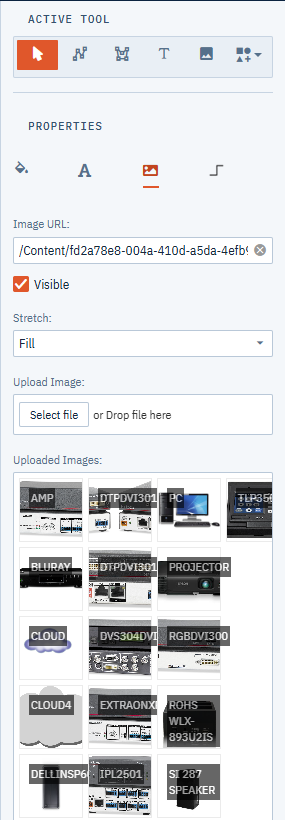
- Image URL is the address of the picture. Clicking a picture under Uploaded Images fills it in. Clear the field to remove the picture from the selected items.
- Visible shows or hides the picture without removing it.
- Stretch sets how the picture fits its frame:
- None: natural size.
- Fill: stretched to fill the frame, even if that distorts it.
- Uniform: as large as fits inside the frame, keeping its proportions.
- UniformToFill: fills the frame, keeping its proportions and cropping what doesn’t fit.
- Upload Image adds a picture file to the project. Click the button to browse, or drop a file on it. Only image files are accepted, up to 20 MB.
- Uploaded Images lists the pictures uploaded to this project, so every drawing in the project can use them.
To add a picture
- Select the item.
- On the Image tab, upload the picture if it isn’t already under Uploaded Images.
- Click the picture under Uploaded Images. It is applied with Stretch set to Fill; change Stretch if you want another fit.
To delete an uploaded picture, right-click it under Uploaded Images and choose Remove. This deletes the file from the server. Items that used it may keep showing it for a while from your browser’s cache, so replace the picture in those items too.
Page borders
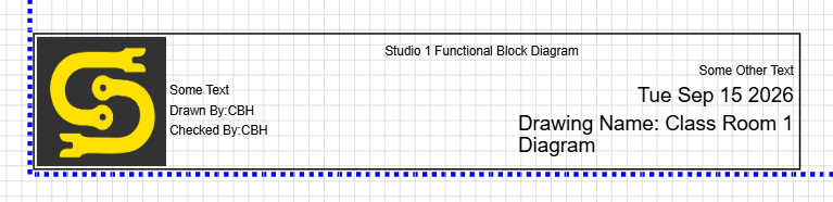
The Page Borders section of the library pane has title blocks and frames to describe the sheet. Switch the section to List to read what each one is.
Title blocks
- Title block: a horizontal block for the bottom of the page, with a frame for your logo.
- Side strip: a tall strip you can resize to the height of the page.
- Classic title block: drawing number, revision, sheet number, and lines to sign off who drew and checked the drawing.
- Revisions: a table of revision rows. Right-click it to Add revision row or Remove last revision row, then fill in each row.
Frames and strips
- Page frame: a frame that fits itself to the page margins when you drop it, with lettered and numbered zones along its edges.
- Bottom strip: a title strip that fits the width of the page, at the bottom.
- Frame, bottom strip and Frame, right strip: a page frame with a title strip along the bottom or down the right side.
A frame or strip sizes itself to the drawing’s margins as you drop it, so set the page size first (see Page Setup and Drawing Settings). The others you resize yourself.
Drag one onto the canvas and fill it in:
- Select the border and choose a logo on the Image tab. It appears in the grey picture area.
- Click the title and each line of text to edit it.
- The date and Drawing Name fill in on their own.
Each line of text uses a Text Kind, so you can style it on the Text tab: the title is Plain Text, and the lines below use Manufacturer, Model, SysName and Alias. Turn on Lock Position on the General tab so the border doesn’t move while you work.